Shopping Cart (0)
Your cart is empty
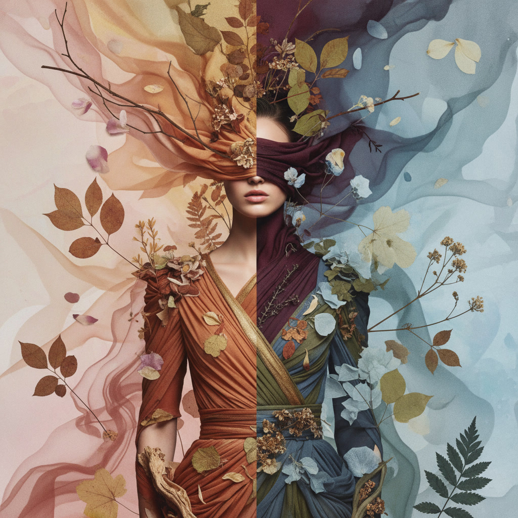
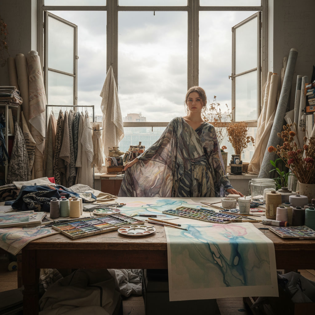
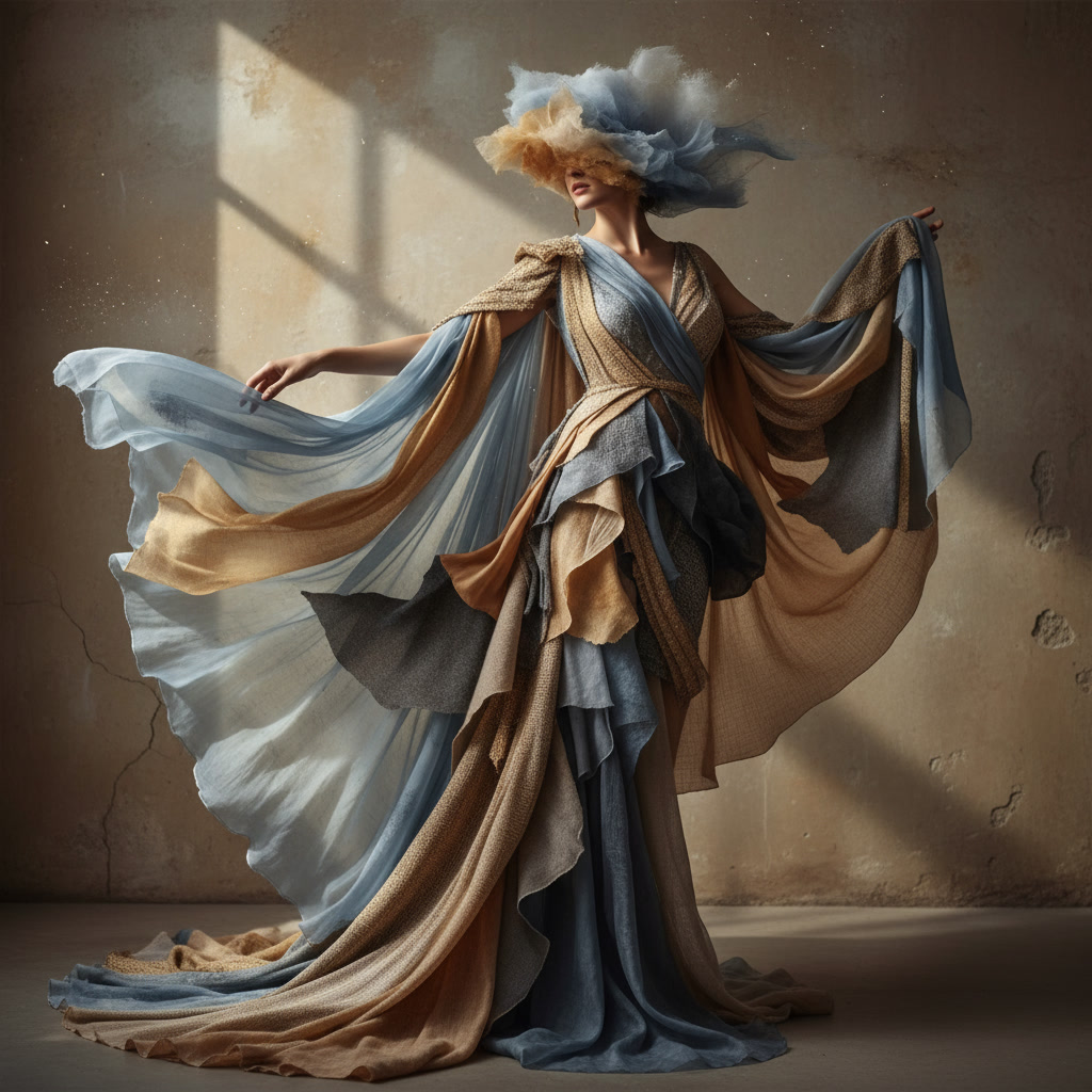
There's a particular gray that only exists on foggy mornings. Not the cold gray of concrete or the sterile gray of minimalism, but something softer — layered with hints of blue, lavender, and the faintest touch of warmth. At Lily & Inc Studio, we collect these colors. We study them. And we translate them into textiles that carry the mood of weather itself.
Weather has always been one of our most powerful sources of inspiration. It's fleeting, atmospheric, and deeply emotional. And unlike static references like paint swatches or trend reports, weather teaches you to see color as something alive — something that shifts, changes, and tells a story.
Weather doesn't present color in isolation. It shows you how light, atmosphere, and environment interact to create mood. A stormy sky isn't just dark gray — it's layered with violet, charcoal, and streaks of pale light breaking through. A sunny afternoon isn't just bright — it's warm gold, soft cream, and deep shadow all at once.
When we observe weather, we're not just looking at colors. We're learning about relationships between colors. How they transition. How they influence each other. How they create emotional resonance. That's knowledge you can't get from a color wheel alone.
Weather also forces you to work intuitively. You can't plan for a perfect sunset or a dramatic fog. You have to respond in the moment, capturing what's there before it changes. That spontaneity keeps our palettes feeling fresh and grounded in real experience rather than theory.
Fog is one of our favorite weather conditions to study. It's subtle, complex, and endlessly nuanced. On the surface, fog might seem like just "gray." But when you really look, you realize it's so much more.
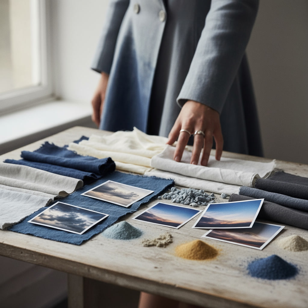
Morning fog often carries cool undertones — pale blues and lavenders that feel quiet and contemplative. Evening fog, by contrast, can lean warmer — soft grays with hints of peach or gold from the fading light. And coastal fog? That has a greenish-gray quality, influenced by the sea and sky.
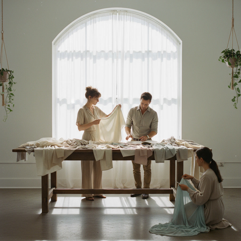
When we translate fog into textile palettes, we don't just pick a single gray. We layer multiple tones — cool and warm, light and medium — to create depth. The result is a palette that feels atmospheric, like you can almost sense the moisture in the air. It's not about literal representation; it's about capturing the feeling of fog.
Rain has a color language all its own. Wet surfaces darken. Greens become richer. Stones turn charcoal. And the sky? Often a pale, washed-out version of itself — soft gray-blues and muted whites.
We love rainy days in the studio. There's something about the diffused light that makes colors feel softer, more muted, and more harmonious. It's a reminder that not every palette needs to be saturated. Some of the most beautiful color stories are the quiet ones.
When designing rain-inspired palettes, we focus on saturation shifts. We take colors that might feel bright on a sunny day and tone them down — adding gray, reducing intensity, letting them breathe. The result is palettes that feel calm, grounded, and a little melancholic in the best way.
Sunlight is trickier than you'd think. It's easy to default to bright yellows and oranges, but that's rarely what sunlight actually looks like. Real sunlight is warm, yes, but it's also nuanced. Morning light is cool and pale. Midday light is intense and slightly harsh. Late afternoon light is golden and soft. Sunset light is layered with pinks, purples, and deep amber.
We study these shifts carefully. When we design sun-inspired palettes, we don't just add warmth — we add complexity. A base of warm cream. A touch of soft peach. A hint of dusty rose. Maybe a deeper ochre for contrast. The goal is to evoke the feeling of warm light without being literal about it.
Sunlight palettes are some of the most versatile we create. They feel optimistic and inviting without being overly bright or childish. They work beautifully in textiles because they bring warmth into a space without overwhelming it.
Storm weather is where we get our most dramatic palettes. Deep charcoals, bruised purples, flashes of pale gray-white light. There's an intensity to storm colors that we love — they're moody, powerful, and emotionally charged.
But translating storm weather into textiles requires restraint. You can't just dump dark, saturated colors onto fabric and expect it to work. The key is balance. We pair deep tones with lighter neutrals. We use contrast strategically. We let the drama come through without overwhelming the design.
Storm-inspired palettes are perfect for spaces that want presence and depth. They're grounding without being heavy. And they carry a sense of narrative — like the fabric itself is telling a story about weather, time, and atmosphere.
One of the things we love most about using weather as inspiration is that it's endlessly renewable. Every season brings new light, new storms, new atmospheric conditions. We never run out of material. And because weather is universal, these palettes resonate with people in a deep, instinctive way. Everyone has experienced fog, rain, and sunlight. They carry memories and emotions tied to those experiences.
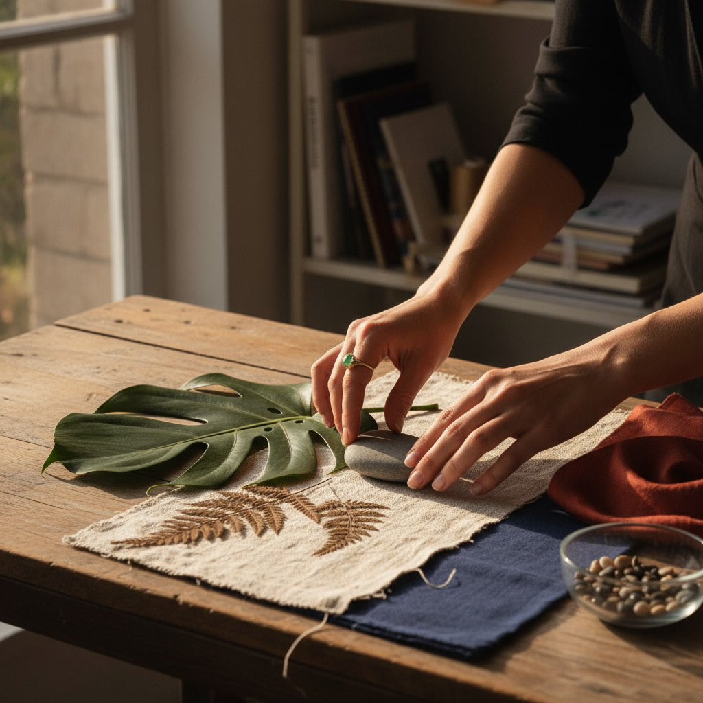
If you want to start observing weather as a color source, here's our advice: carry a camera or sketchbook. When you notice a moment of beautiful light or atmosphere, capture it. Note the colors you see. Pay attention to how they shift. Over time, you'll build your own visual archive — a personal collection of weather moments that can inform your creative work.
And remember: weather color isn't about perfection. It's about mood, memory, and emotional honesty. The best palettes aren't the ones that look good on a screen. They're the ones that make you feel something.
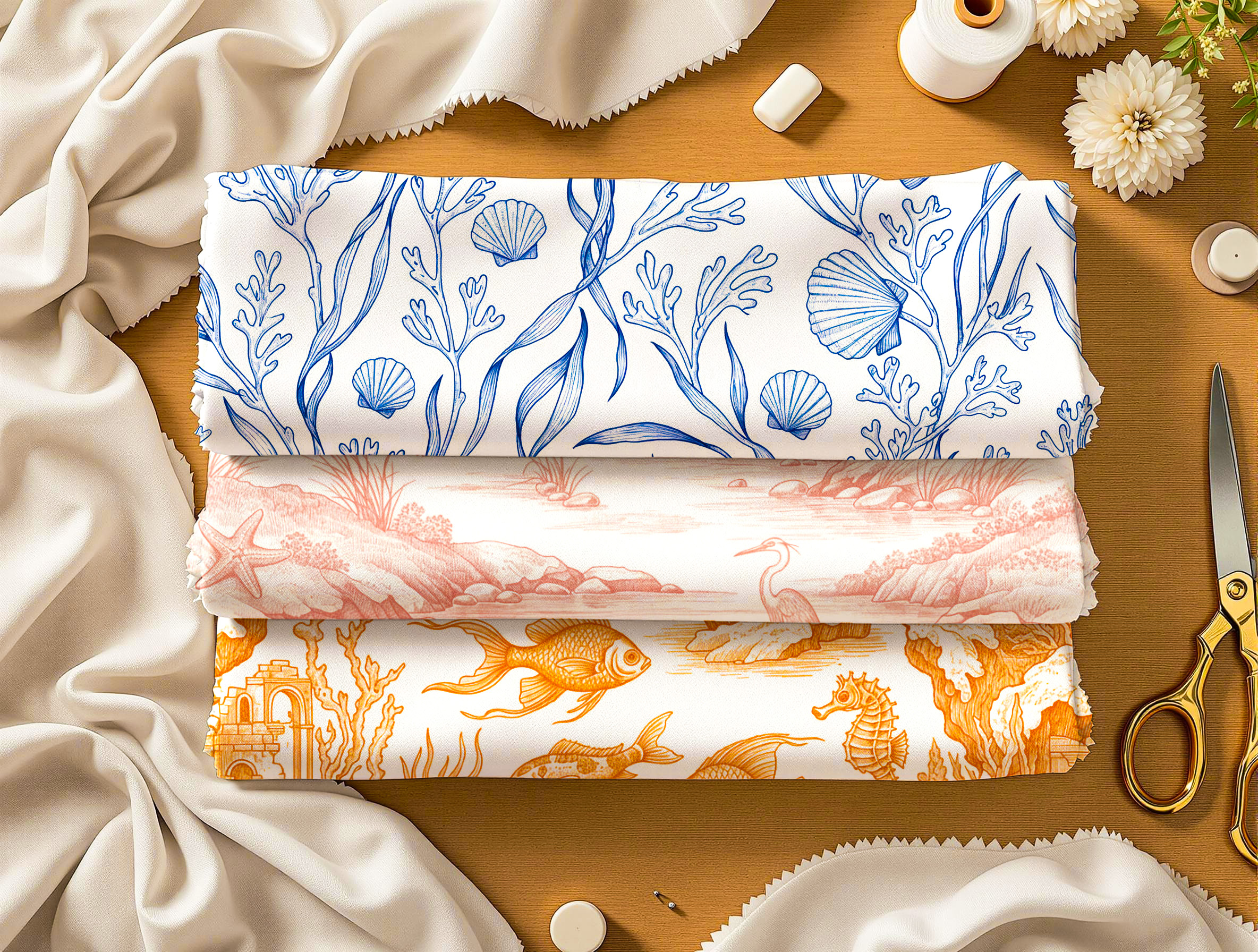
Explore our weather-inspired textile collections.
View Collections