Shopping Cart (0)
Your cart is empty
There's a moment each year when the air shifts. The light changes. The leaves turn, or new growth emerges, and suddenly the colors we've been working with no longer feel right. At Lily & Inc Studio, we don't fight this instinct — we follow it. Because the most honest palettes we've ever created have come from simply paying attention to the world outside our windows.
Seasonal color isn't a trend. It's a rhythm. And learning to design in harmony with that rhythm has transformed not only our work but our entire creative process.
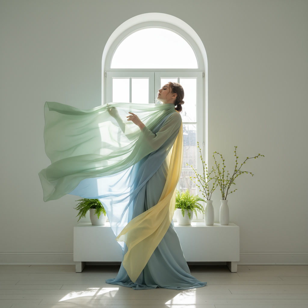
When we design with the seasons, we're not imposing color — we're responding to it. Spring doesn't need to be pastel just because that's the convention. It needs to reflect what spring actually feels like: fresh greens, soft yellows, the cool clarity of morning light.
Autumn isn't just orange and brown. It's the deep rust of oak leaves. The muted olive of fading grasses. The unexpected warmth of late afternoon sun filtering through bare branches. These are the colors that resonate because they're rooted in experience, not theory.
At the studio, we've noticed that our seasonal collections always feel more emotionally grounded. They carry a sense of place and time. And that authenticity translates to how people respond to them — there's a recognition, a feeling of "yes, this is what this moment looks like."


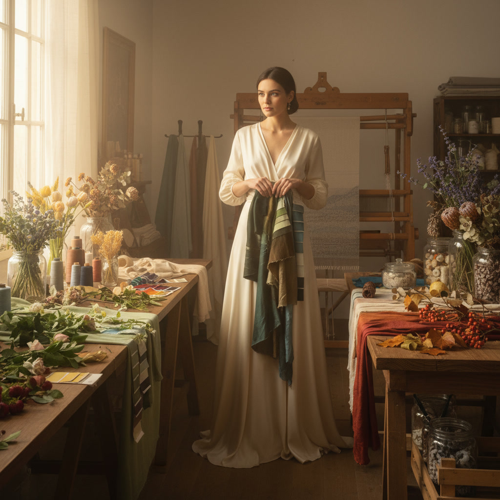
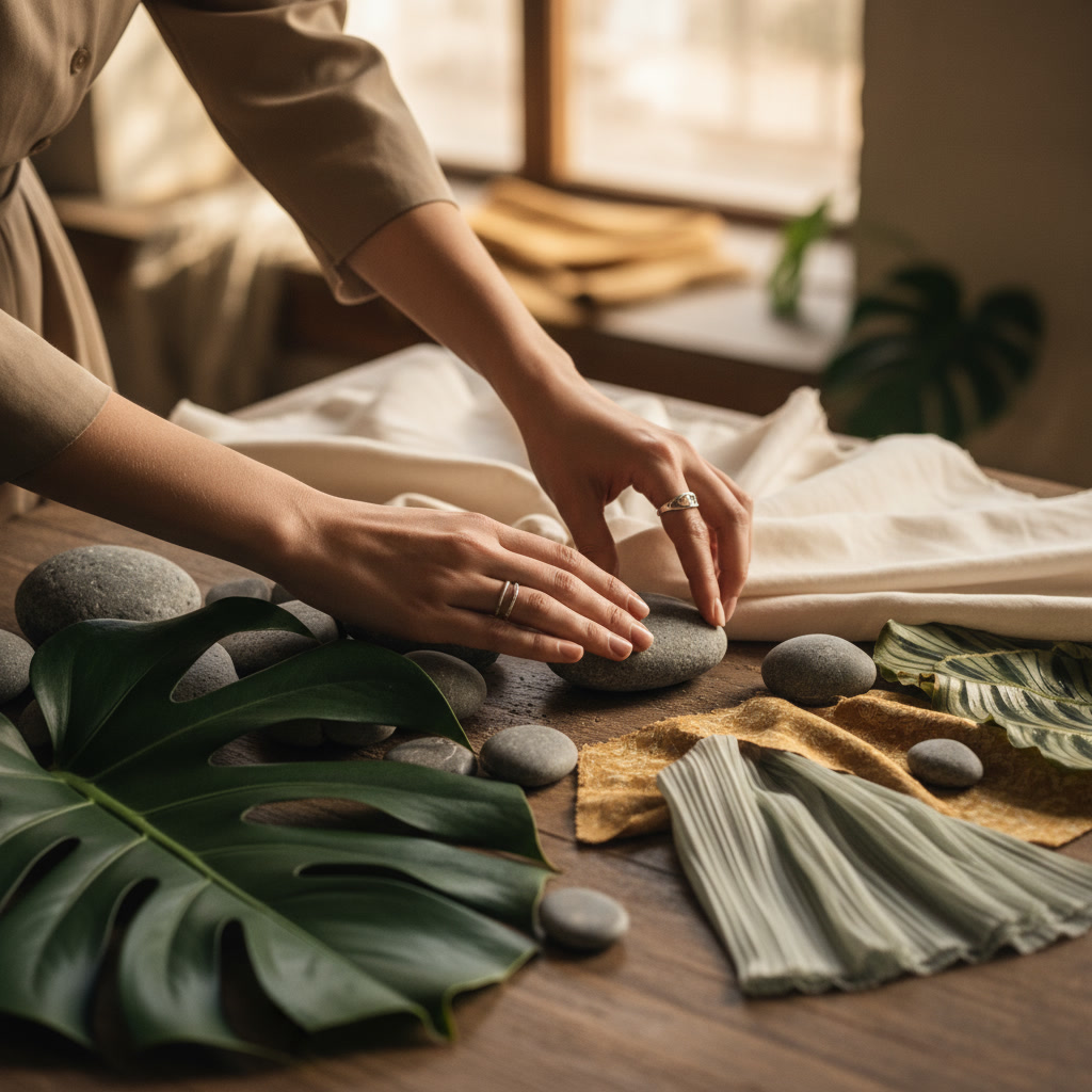
Our seasonal palette process begins with observation, not mood boards. We go outside. We look closely. We photograph. We collect leaves, bark, stones — anything that captures the color language of the moment.
Spring: We focus on new growth. The yellow-green of unfurling leaves. The pale pinks and whites of early blossoms. The soft grays of overcast skies that make those greens feel even more vibrant.
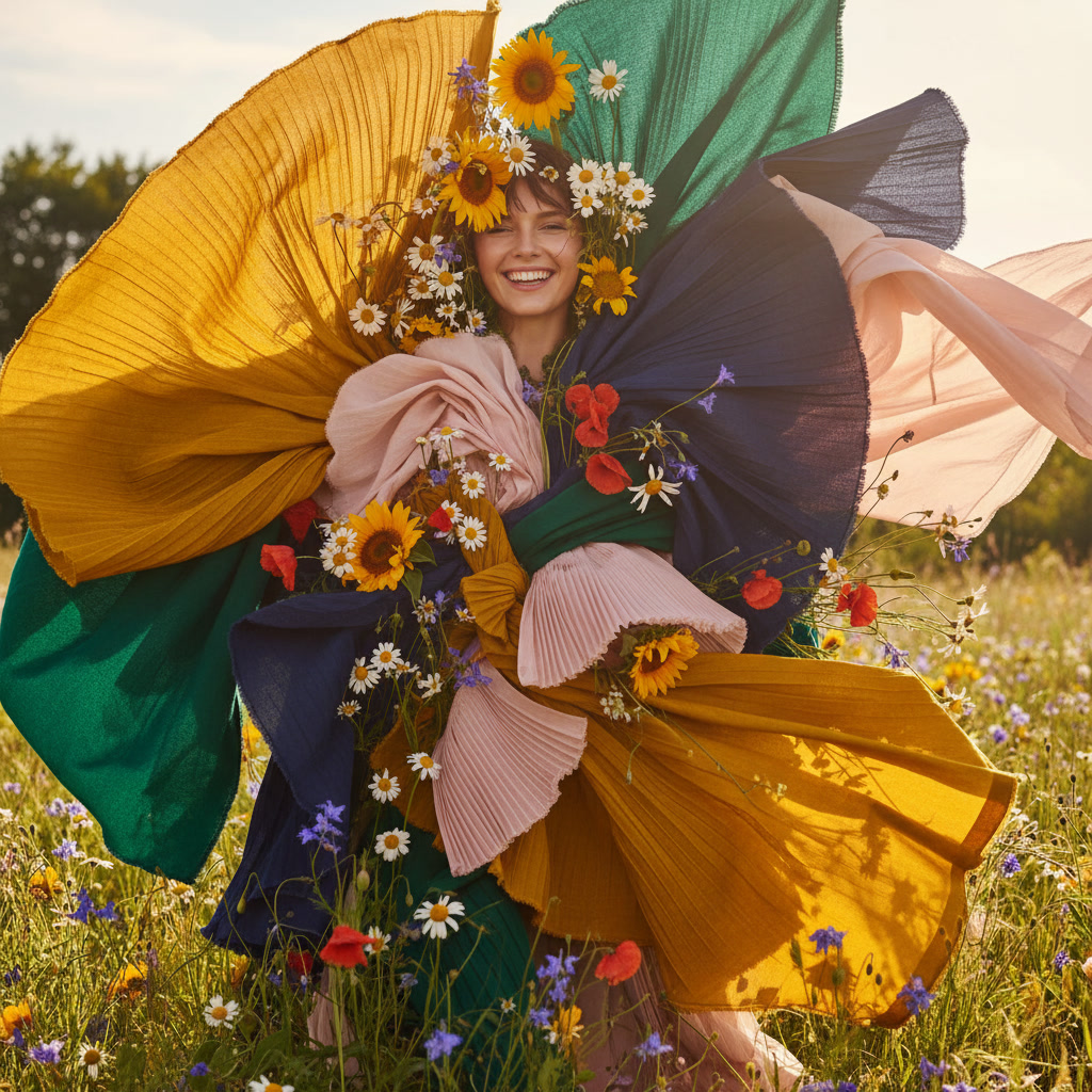
Summer: Deep, saturated greens. The warm beiges of sun-dried grasses. The dusty blues of distant hills in the heat. Summer isn't bright — it's rich and grounded.
Autumn: Warmth with depth. Burnt sienna, ochre, deep plum. We look for the subtle shifts — how a red leaf isn't just red but layered with browns and purples.
Winter: Restraint and contrast. Cool grays, soft whites, the occasional shock of evergreen. Winter teaches us that less color can say more.
Observing color is one thing. Translating it into a cohesive textile palette is another. We don't replicate nature exactly — that would be literal, not interpretive. Instead, we extract the essence of seasonal color and adapt it for fabric.
For example, autumn's vibrant reds and oranges might feel too intense for a large-scale textile. So we tone them down — we add gray, we soften the saturation, we layer them with neutrals. The result still feels like autumn, but in a way that's livable, wearable, and timeless.
We also consider how colors interact with texture. A rough linen will absorb and diffuse color differently than smooth silk. Seasonal palettes need to adapt to material as well as mood.


Designing with the seasons has brought unexpected benefits to our studio practice. It creates a natural rhythm to our work. We're not constantly chasing new ideas — we're letting nature guide us. This removes some of the pressure and makes the process feel more intuitive.
It also encourages restraint. When you're limited to the colors of a particular season, you can't rely on endless variation. You have to refine. You have to make intentional choices. That constraint has made our palettes stronger and more focused.
And perhaps most importantly, it keeps us connected to the world outside the studio. It's easy to get lost in screens, trends, and digital references. But when your palette comes from a walk in the woods or a quiet morning observing light, the work feels grounded in something real.
We've been working this way for years now, and it's become fundamental to our identity as a studio. Each season brings a fresh palette, a fresh perspective, and a renewed sense of creative direction. We're never bored because nature never repeats itself exactly.
This approach isn't just aesthetic — it's philosophical. It's a reminder that design doesn't exist in isolation. It's part of a larger conversation with the world around us. And when we listen to that world, the colors we choose feel more honest, more resonant, and more alive.
If you're drawn to seasonal color, you don't need to redecorate four times a year. Instead, think about layering. A few autumn-toned cushions. A spring-inspired throw. Small shifts that honor the changing world outside your window without requiring a complete overhaul.
We design our textiles with this in mind — pieces that can stand alone year-round but also harmonize beautifully when combined with seasonal accents. Because good design should be flexible enough to evolve with you.
Explore our seasonal collections and find your palette.
View Collections