Shopping Cart (0)
Your cart is empty
There's a certain kind of color that doesn't demand attention. It doesn't announce itself. It simply is — quiet, grounded, and endlessly adaptable. At Lily & Inc Studio, we call these the "colors of silence": the natural neutrals that create space for everything else to breathe. And in 2025, we're returning to them with renewed intention.
In a world that feels increasingly noisy, these colors offer something rare: calm. Not the stark, clinical calm of pure white walls, but the warm, lived-in calm of natural materials and muted tones. The kind of calm you can build a life around.
Neutrals aren't a trend — they're a foundation. While bold colors come and go, neutrals remain because they serve a deeper purpose: they create context. They allow other elements — texture, pattern, light — to take center stage without competing for attention.
But not all neutrals are created equal. The ones we're drawn to aren't flat or lifeless. They have depth. They shift with the light. They carry subtle undertones — hints of warmth or coolness — that make them feel alive rather than static.
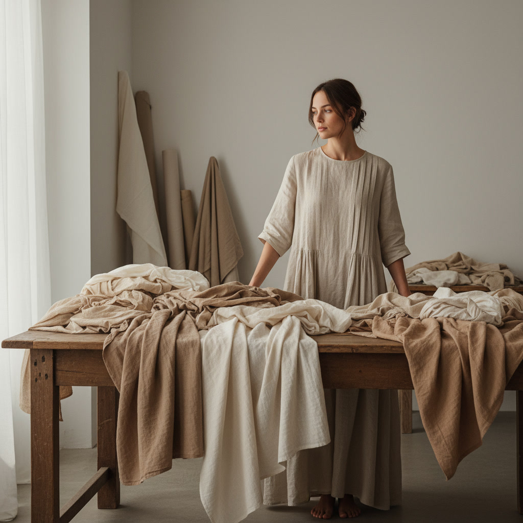
Natural neutrals, in particular, feel timeless because they're rooted in the materials of the world around us: linen, stone, clay, wood. These are colors that have existed for centuries, and they'll continue to feel relevant for centuries more.
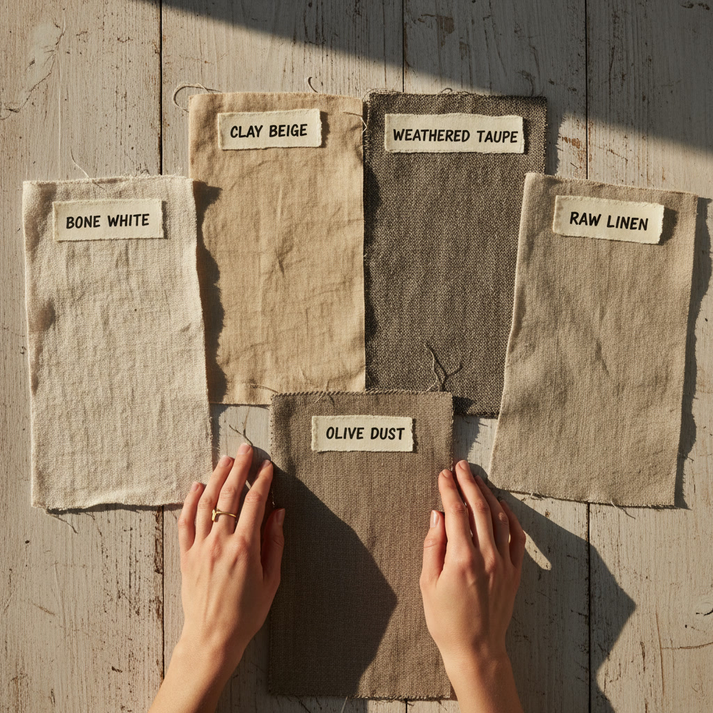
As we design for the year ahead, a few key neutrals have emerged as favorites. These are the colors we keep coming back to — the ones that feel both fresh and familiar.
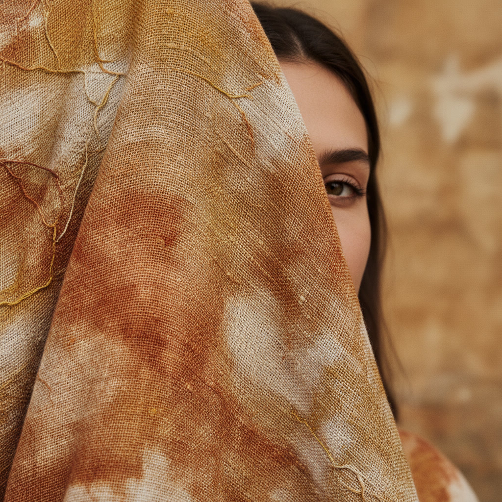
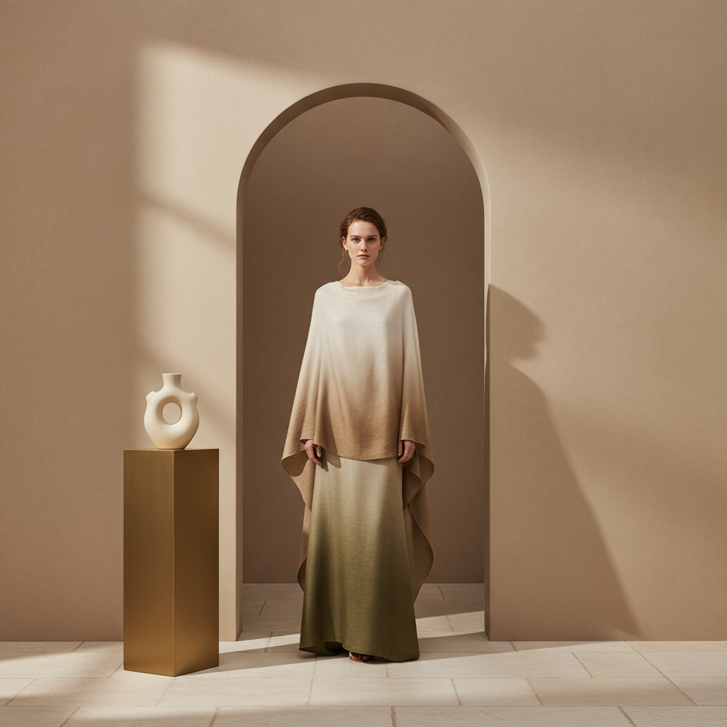
Warm Clay: A soft, earthy beige with terracotta undertones. It feels grounded and human, like sun-baked earth or aged pottery. We love it on linen for its warmth without heaviness.
Pale Olive: A muted green-gray that bridges the gap between neutral and natural. It has just enough color to feel alive but stays understated enough to act as a neutral backdrop.
Cream with a Cool Edge: Not stark white, not pure beige — something in between. A cream that leans slightly cool, almost gray in certain light, giving it a modern, airy quality.
Soft Charcoal: A deep, velvety gray that anchors a space without feeling heavy. It's the neutral we use when we want presence without drama.
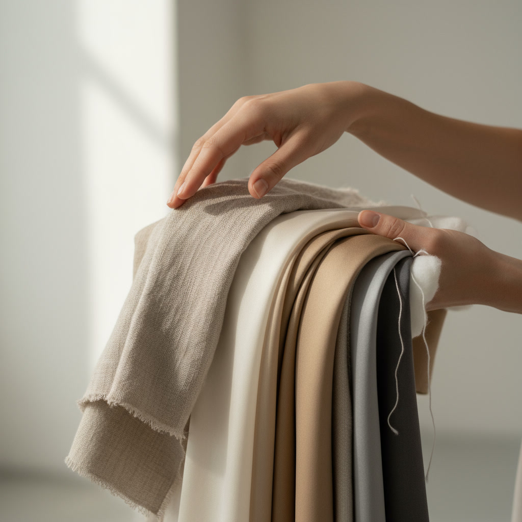
One of the most common misconceptions about neutrals is that they're boring. The truth is, neutrals become interesting when you layer them. A single beige wall might feel flat, but combine three or four tonal variations — through textiles, furniture, and natural materials — and suddenly you have depth, warmth, and visual intrigue.
We approach neutral palettes the way a painter approaches a tonal study. It's about subtle shifts, not bold contrasts. A cream linen paired with a slightly warmer beige cushion. A pale olive throw layered over a soft charcoal sofa. The variations are small, but they create richness.
Texture plays a huge role here. When you're working with a limited color range, texture becomes the star. Woven linen, smooth cotton, rough-hewn wood, soft wool — each material adds a new dimension to the overall palette.
There's a reason we keep returning to neutrals: they create calm. Not the absence of energy, but the presence of ease. A room filled with natural neutrals feels like a deep breath — spacious, peaceful, restorative.
This is especially valuable in 2025, as we collectively seek spaces that offer refuge from the constant stimulation of modern life. A home doesn't need to shout to be beautiful. Sometimes the most powerful design choice is restraint.
We've noticed that our clients who choose neutral palettes often report feeling more grounded in their spaces. The visual simplicity allows them to focus on what matters: connection, creativity, rest. The environment becomes supportive rather than demanding.
The key to successful neutral design is variation — not in color, but in tone, texture, and light. Here's how we approach it:
Vary Your Tones: Don't use the exact same neutral everywhere. Mix warm and cool undertones. Pair a warm clay with a cooler gray. The subtle contrast keeps things dynamic.
Introduce Texture: Smooth and rough. Matte and subtle sheen. Woven and solid. Texture adds visual interest even when color stays quiet.
Play with Light: Neutrals are incredibly responsive to light. A beige that feels warm in morning sun might appear cooler in evening shadow. Design with this in mind — let the light do some of the work.
Add Organic Elements: Wood, stone, plants. These materials bring life and movement into neutral spaces without disrupting the overall calm.
In a culture that celebrates the loud and the bold, choosing neutrals is a quiet act of rebellion. It's a statement that says: I don't need constant visual stimulation. I value peace. I trust restraint.
And that trust is what makes neutrals so enduring. They don't chase attention. They create a canvas. A foundation. A place where life can unfold without the backdrop competing for focus.
One of the most practical benefits of neutral palettes is their longevity. When you build a space around natural neutrals, you're not locked into a specific trend or moment. You can shift accents, swap textiles, and evolve your style without needing to overhaul the entire foundation.
We design our neutral textiles with this in mind — pieces that feel timeless now and will continue to feel relevant years from now. Because the best design isn't about what's new. It's about what lasts.
Explore our collection of natural neutral textiles.
Shop Neutrals